case studies
duncan hines
The goal of this project was to completely overhaul the dated look of the client’s existing and new dessert brands. We partnered with Minneapolis creative group Baker to develop test photography, using actual Duncan Hines® product rather than the designers pulling scrap artwork, to bring their new out-of-the-box concepts to life. Dennis took the opportunity to really explore the best camera angles for the food and Lisa styled in a much more casual way, moving away from the exacting perfection of conventional packaging shots. We ended up with compelling images that strongly influenced the final designs chosen by the client.

This layout concept matched the uniqueness of the product itself, taking a staple refrigerated pudding to a new level of indulgence. Among other expected designs featuring the layered dessert, this single spoonful draws the viewer in. We experimented with a more realistic spoon-dip into the pudding but ended up with this stylized and more alluringly dramatic vision that highlights its luxurious texture.

With few exceptions, most companies that market traditional box cake mixes feature their products meticulously frosted and sliced, plated with a fork. Camera angles tend to align with views that say “I’m about to sit down and eat.” This innovative layout, designed by Craig Oldakowski of Baker, turned the idea of a forkful of cake on its head. We loved playing with how to frost, cut, and anchor the food so Dennis could give the pieces some drama with his lighting. We put on our problem-solving hats and first tried sliding the tiny cake wedges onto thick skewers so they could be captured straight on. When that didn’t quite work (they’d spin around or fall off), we made small pedestals for the cake to sit on. Duncan Hines® markets two lines of mixes—their classic cakes, like vanilla, yellow, and chocolate—and a signature line featuring flavors like lemon supreme, carrot cake, and chocolate fudge. Part of the charge was about visually differentiating the cakes in each series. We chose to bake & frost the standard double layers for the classic flavors. The signature cakes were sliced into multiple layers, more bakery style, and Lisa came up with interesting garnishes that were not only pretty, but also told a flavor cue story. The designers created some fun, but still subtle, background artwork and added the fork in post-production for a consistent look—everyday stainless steel for the classic cakes, gold ware for the signature line.

This is the design chosen by the client from several layouts pitched over the course of a month. We appreciated being part of the process early on—we feel strongly that we can be strategic partners during this testing phase of creating new packaging. Because we worked side-by-side with the designers, the exploration we had time to do on set could be implemented in refining layouts before sharing them with the client.
just bare chicken
We couldn’t have had a more perfect client than Just Bare Chicken®, a brand of all-natural and organic chicken, produced by Minnesota’s Gold’n Plump® poultry company. Lisa joined the brand as their culinary expert early on, as a media spokesperson, recipe developer, and weekly blogger. She brought Dennis on as their go-to photographer before a visual identity for the brand was established. Because the company had no internal consumer culinary resources, we became their impromptu test kitchen & photo studio—leading to a 10-year relationship that recently concluded when the company was sold.

We were given a tremendous amount of freedom as we created new content for their web site and consumer resources (recipes with lots of photo, cooking & technique advice), eventually creating the “look” and style for the brand—targeting what the client defined as home cooks that really care about where their food comes from, a more sophisticated audience that likes to cook from scratch and has a modern aesthetic that embraces both vintage and contemporary elements.
At the start of our relationship, we were conservative in our photo style, with our first studio sessions creating approachable images that illustrated straight-forward recipes. But as time passed and the client was happy with all the content we produced, we began to push the boundaries, exploring what at the time was less in vogue for most basic American food company consumer service. We chose to move to overhead shots in a more editorial or magazine format, propped in unique ways with vintage tableware & contemporary surfaces and textiles. The styling of the food was beautifully approachable, but artful, playing up the use of fresh herbs and interesting ingredients.
Over time, as the brand transitioned from being regional to national, Just Bare’s promotion agency used a series of our images to create print ads that ran in Cooking Light, Eating Well, and other cooking magazines.
Our focus as we planned each shoot was to really emphasize the freshness of the product, never shying away from showing raw chicken. Lisa focused on essential cooking methods in her blogging and recipes; Dennis brought his love of cooking to the final shots—we often shot a series for each recipe, starting with cooking in process or an informational ingredient composition, moving into a safely plated version, and finally becoming the diner. Dennis liked to take a knife and fork and cut into the food, upping the appetite appeal. That last view often ended up being our favorite.
The brand ran several national cooking contests that Lisa headed up, screening & testing recipes and choosing the winners. The third year a digital cookbook was made available with twenty 5-ingredient recipes. We created a very simple, consistent look, shooting each recipe as a single serving on a white linen surface. Plates were sometimes layered on vintage cutting boards or placed on folded napkins—all shot with some kind of special finishing touch that drew the viewer in. As a full series, the images worked beautifully together.

The body of work we produced for Just Bare Chicken® stands the test of time—the archive online of hundreds of recipes and photos are still in use on their web site and every social media platform.
roots for the home team
When Susan Moores, the founder of the Roots for the Home Team®, asked if we could help her with photography for her new entrepreneurial youth program, we were honored to be asked. Her concept features partnering youth gardens with major league baseball, involving the garden kids in developing salad recipes that they sell each season at Target Field. Their Salad Up! cart allows the youth to learn about growing food, the nuances of running a business, and leadership skills. Dennis & Lisa collaborate with Susan to create beautiful photos for the cart and recipe cards each year—the program is in its eighth season and it’s one of our favorite partnerships. Lisa helps edit the youth recipes as well, offering the occasional suggestion for making them as consumer friendly as possible for any baseball fan that wants to recreate the salads at home.

For the first year of the program photography was a blank slate. We brainstormed with Susan about how we’d compose the shots—and ended up with one of our favorite concepts, an old garden trowel becoming the vehicle for showing off each menu offering. The challenge became working in the micro—Lisa carefully arranged the ingredients with her tweezers, so it was clear what each recipe contained. Dennis lit the salads with a freshness that brought the sense of available light, with shadows that hint at the blue of the sky. Moving forward, each year is a little different, but the goal remains that we stay true to the recipes so fans at the salad cart can really see what they’re buying.
The current look for Roots includes a scattering of some of the uncommon ingredients that the garden youth are growing. Each garden crew is teamed up with a local chef, who help them craft unique salads with a global spin that reflects the diverse heritages of the youth, which gives us some interesting foods to feature.
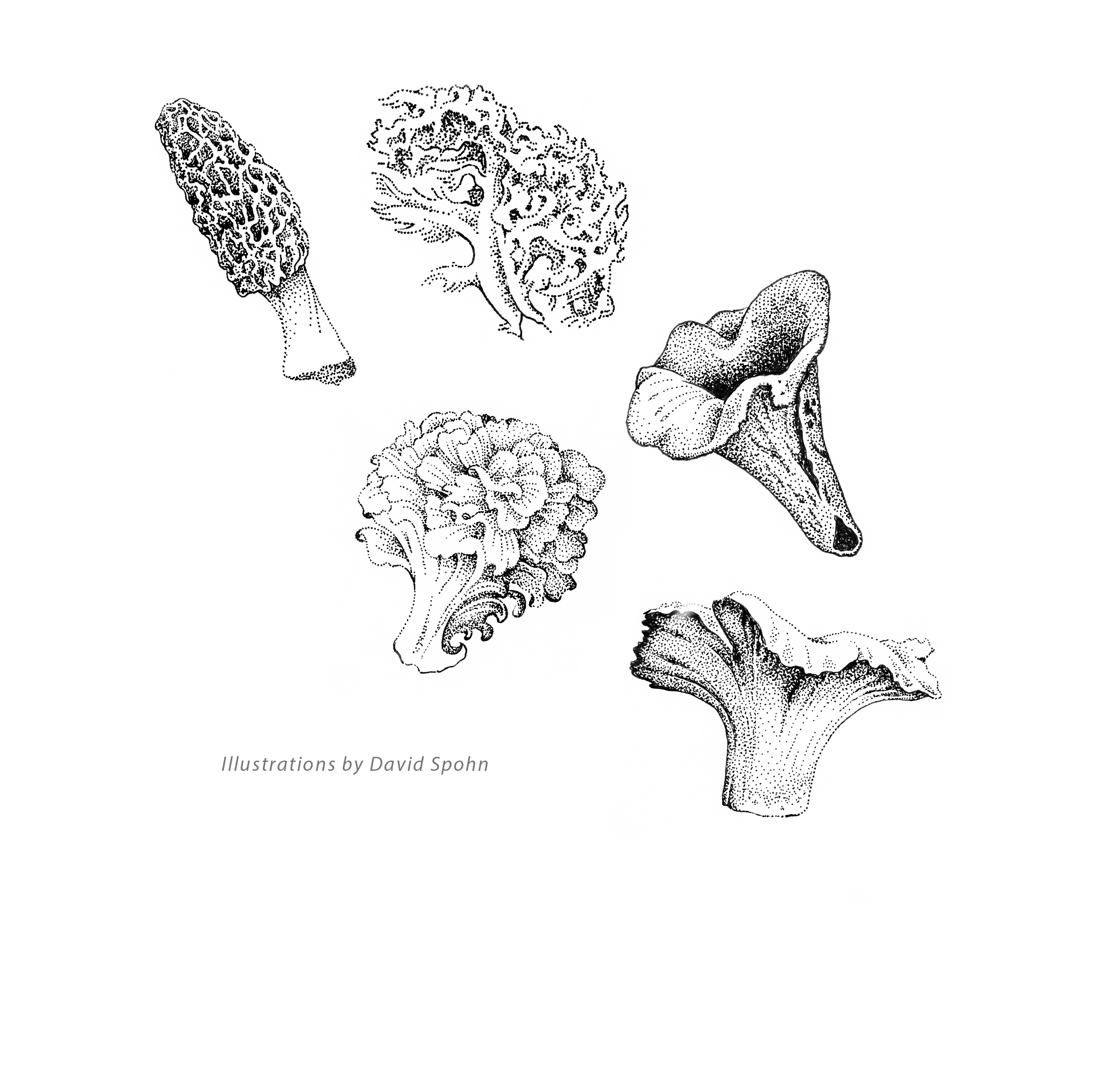
untamed mushrooms
Our original storytelling at 2fish1dish began as a long form photography blog, featuring interesting people and agricultural or natural world subjects. After a story we posted about foraging for wild mushrooms, we were offered the chance to write a full-blown book. Our journey lasted two years, resulting in the publication of “Untamed Mushrooms: From Field to Table” in 2018. It was a project with completely open borders—once we got our wild fungi expert on board (Michael Karns, the intriguing guy we featured in the original blog post) we began the process of creating a plan.

We decided to approach what is an almost daunting topic by narrowing the focus to 13 species of edible wild mushrooms, first sharing armchair guidebook information about each one, while Lisa organized and developed seasonal recipes and handling advice. It became the perfect vehicle for us to showcase all of our creative skills.
Dennis spent hours out in the field with Michael, shooting mushrooms in their natural habit. And Michael brought perfect specimens to the studio for both recipe and ID shots. Dennis had the idea to capture Audubon-style portraits of each mushroom—both artful and arresting. He used studio lighting and a surface with an organic feel to really highlight the beautiful shapes and colors.


Early on we chose to shoot the recipes on a set next to an old floor-to-ceiling warehouse window that Dennis rolls into a garage door space at the rear of his studio. Working with available light delivered a true seasonal feel to the photos. Lisa enjoyed the set access, moving around without the hindrance of light stands. The styling of each recipe was very loose and real (grilling in the rain out in the parking lot was a highlight)—the food was prepped, sometimes shot in process or arranged in a pan or baking dish and captured uncooked. Then we shot cooked and plated versions, so we had a wide variety of images to choose from as Dennis laid out the chapters. And we always had something good to eat for lunch.

As a team, in tandem with our official book designer David Spohn, we made decisions about the overall look and layout of the book. And once copy editing was complete, we ultimately handed over a finished PDF of the manuscript. We knew this was a unique way to work, but our team had the creative abilities to pull everything together and we were given a lot of latitude by the publisher.
The book released to a wide, supportive audience. We received wonderful reviews and it was awarded a 2018 Midwest Book Award for overall design, was a finalist for best food photography & styling by the International Association of Culinary Professionals (IACP), and was also a finalist for an International Gourmand Cookbook award.